
07 Jun How to Visualise Geographic Time Data – Analysis of the Water Quality in Europe
The Findings
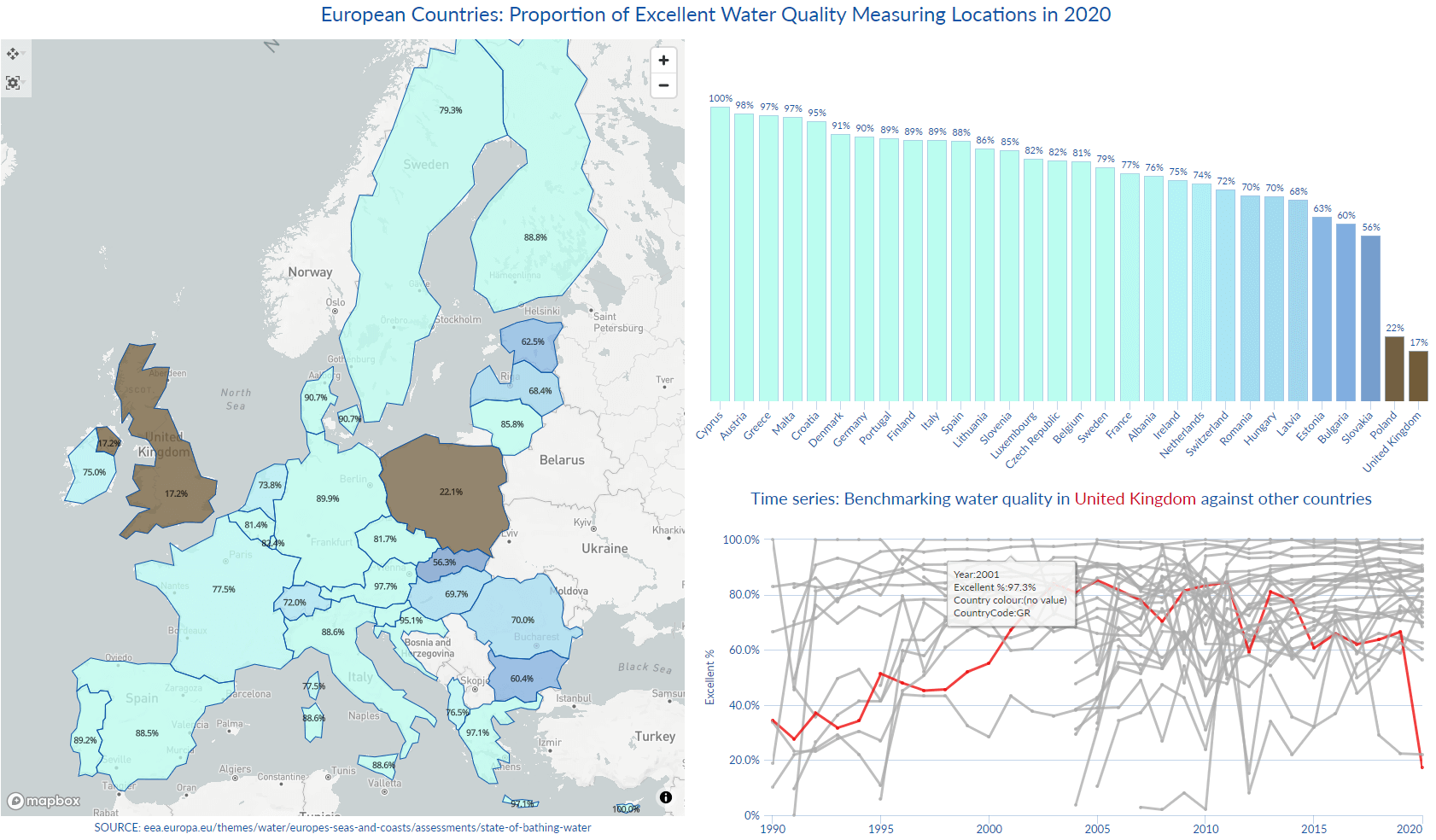
Are you only as good as your last performance? Analysis of the water quality in Europe in the year 2020 looks impressive – an assessment of coastline, lakes and transitional waters rated the majority of locations as “excellent”. Star country Cyprus achieved a 100% rating, while only two countries recorded less than impressive results.
Focusing on Poland’s performance we see that only 22% of the sampling locations are rated “excellent”, also that 401 data points out of 602 never submitted a measurement. With these records filtered out, the situation has changed: 66% of the submitted results are rated “excellent”, which is in line with the country’s results in the last 10 years. It is worth noting that Poland recorded dramatic improvement in 2011, jumping from just 24% to 67%. So – Poland’s result can be attributed to the data recording method, rather than an actual poor performance.
(Link to the interactive report)
On the other hand – the UK has shown notably poor records against the European neighbours in the last 10 years and the country has managed to record a performance over 80% only in 2013.
According to the Guardian “All English rivers have failed to meet quality tests for pollution amid concerns over the scale of sewage discharges and agricultural and industrial chemicals entering the water system.” Also that “water companies had poured raw sewage into rivers on more than 20,000 occasions in 2019, and dumped thousands of tonnes of raw sewage on beaches.”
Similarly to Poland, only a subset of the 640 registered measuring locations reported results in 2020 (183). When only those results are taken into account, the rating is 60%, which still leaves the UK at the bottom of the league.
This leads us to another question – how come that Great Britain, an island country with a coastline which is 12,429km long, has only 640 registered water quality measuring stations? Greece’s coast is 13,676km long an
d Italy’s coastline is about 7,500km long. Italians are measuring the quality of water in over 5.5K locations, France over 3.2K, Germany 2.2K and Greece in 1,634.
The most encouraging finding is that all countries (apart from the UK) have shown significant improvements over time, especially countries who joined the EU in the later wave, like Romania (where the proportion of ‘excellent’ ratings was increased from 6% to 70% in 13 years). EU membership candidate Albania has also improved from 51% in 2013 to 76% in 2020.
The UK has chosen to opt out of the EEA membership following Brexit, so this dataset will be the last one to include the UK and compare it to other European countries on a like-for-like basis.
How we made it: The data visualisation challenges
Every data visualisation has two phases: first the analyst needs to explore the data – to sort, compare, isolate, and identify relationships or trends. The second task is to communicate the findings effectively to an audience. Charts and tools used in the first ‘probing’ and exploratory phase are not necessarily the same visualisations to use for the story-telling presentation.
A challenge in this report was to create a comparison of results in the year 2020, on a geographical level, then provide perspective about the developments over time and explain how the countries got there. Is a good / bad result an outlier or is in line with a long-term trend?
From the macro level we can zoom into each individual performance and drill all the way down into the results for each measuring location. In two tabs we are moving from the continent/country aggregation down to your local beach/ river/ lake. We are going on a journey in space and time.
On the first tab the map with shapefiles aggregates the countries’ latest results and instantly identifies the two ‘offenders’ – a view that is complemented by the two bar charts: the first one ordering the % scores and another one adding context with regards to the number of measuring locations per country.
In a dataset with 30 countries and 30 years of data, it was useful to create a benchmarking effect and highlight one country of interest, while keeping the others in the frame grey – see the layered line view, which is driven by the Country Choice variable (configured in the Report Data Sources).
On the Country tab the viewer can follow the progress of one country at a time (filter choice limited to 1) and explore the spatial distribution of measuring places, as well as the performance over time on both the aggregated level and individual location level.
Data titles on both tabs are dynamic,
created by using Content view with integrated formulas, responsive to filtering; interactive heatmap is a Pivot chart with the cell values removed.
In this report not a single data point is wasted – curious viewers will be able to check the water quality before they dip their toes into the river, lake or the sea of their choice.
Londoners will have to satisfy themselves with the results for the Serpentine lake (rated ‘poor’ in 2020) and hope that Thames water will be rated soon!

Data transformation and preparation challenges
The dataset comes from the European Environment Agency: each record represents a measuring location, while each year of results was added as a new column. This is a straight-forward de-pivoting exercise, where we go from 43 fields x 22,276 records to 14 fields x 690K records! https://www.eea.europa.eu/themes/water/europes-seas-and-coasts/assessments/state-of-bathing-water/state-of-bathing-waters-in-2020
Another challenge was to handle the 3 location Management status fields (Management2018, Management2019, Management2020), which were applicable and populated only in the last 3 years. De-pivoting them with the rest of the dataset was not an option. These fields were therefore isolated, de-pivoted on their own, then merged with the main dataset, so they joined only the relevant records (merging on both location ID and Year fields).
Data transformation depends on the visualisation requirements – once the basics are done (field formatting, cleaning, classification, validation) requirements will come from the visualisation. Is the data orientation suitable for the charts, what is the data granularity required for the analysis? Are all the fields in the dataset relevant? The cool thing about Omniscope is that the ETL (transformation) and visualisation components go hand-in-hand. The visualisation can come first and be used for the data diagnostic purposes, to decide on the course of action, then again at the end, for the data presentation. The analyst can seamlessly go back and forth, flip between the two modes, and make changes to the underlying data, even while in the middle of the visualisation job, to quickly shorten the label, change a data field format or add a new calculation.
No Comments